So I’ve at last decided on a name – that took a while – but milomade it is. Just need to decide on a logo now and having a bit of a dilemma…
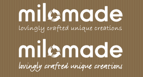
WRONG FONTS…

WRONG STRAPLINE TEXT…

plus not so keen on the recycling arrows as they imply I’m solely doing recycling which I’m not. So decided to change those too…and drew a button.
BUTTON OPTION…

I then scanned a load of buttons and I like the following two:
BETTER BUTTON OPTIONS…


I’m torn between these two buttons and not sure whether to use the red on or the loveheart one. I may decide to use both and alternate between them. Strapline need work though as it’s unreadble and I don’t like the swirl the the left anymore.
OK – Final option is to keep the strapline redabel and simple and the surround the whole thing in stitching like this:

This is the high contrast version I’m going to use for letter heads and print based cards etc…online I’ll use it against the brown paper background of the other ones above.
Well I’m glad that’s sorted!


